 EN
EN FR
FR DE
DE ES
ES NO
NO SV
SV FI
FI DA
DA LV
LV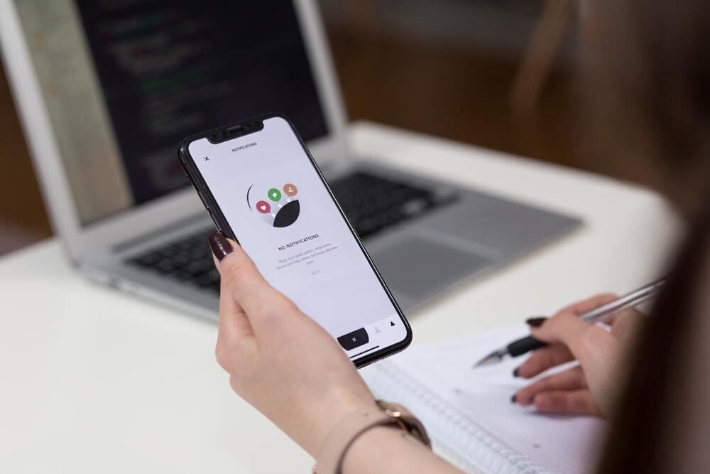
As accessibility testers, during our daily round of website testing, we often encounter live chat widgets integrated into a website. And more often than not, these live chat widgets do not comply with accessibility regulations, which is simply not acceptable. But what does an accessible live chat widget mean and what barriers do people with disabilities face when they come across an inaccessible one?
Well, in general, an accessible live chat refers to a widget or separate website feature that can be used by a variety of users, regardless of their disability, to communicate with company representatives in real time. In this blog post, we will look closer at live chat widgets by exploring the basic accessibility requirements to consider and looking at why accessibility testing is important. We will also share some useful tips and tricks to design, create and test an accessible live chat widget to ensure it is accessible to all users.
Color contrast

The live chat feature can appear on any website and is usually implemented as a dialogue or expanded section in the bottom right corner. It can be a live chat with a salesperson, a support team or even a consultation with a doctor.
To make the chat feature more noticeable, it should be properly labeled. Provide a clear and understandable visual label for a dialogue, section, or button that triggers the live chat.
For visually impaired users, ensure a minimum color contrast ratio for text, i.e. 4.5:1 for normal text and 3:1 for large format text. Also, provide a minimum contrast ratio of 3:1 for interactive elements in chat, such as the color of the button versus the adjacent color. This helps users see the boundaries of the elements. Text style properties, such as spacing, line height, letter spacing, and word spacing should also be adjustable.
How to test color contrast
Use color contrast analyzer add-ons for browsers, like the WCAG color contrast checker, to perform a color contrast analysis or check it manually with the Color Contrast Analyzer (CCA) tool. To check text style properties you can use the text spacing bookmarklet by Patrick H. Lauke.
Keyboard navigation

To make the live chat accessible to keyboard users, include a widget in the tab order. The user should be able to trace the chat dialogue or chat window and interact with it using the keyboard only. A good practice is to include a web chat element in the skip link feature. This way, the user can move to the chat window immediately after refreshing or landing on the page rather than having to scroll down through all the content.
Navigation within the chat widget is also important. When opening the chat window, the first focusable element is usually the message input field and then the send button or icon. When other interactive elements are displayed within the chat window, a logical and meaningful sequence should be followed.
If conversation does not fit into the chat window, and when new messages are rendered, a scroll bar should appear. The user should be able to access previous messages using the up/down arrow keys.
How to test keyboard navigation
Use only the keyboard to interact with the widget. Press the Tab key and focus on the chat trigger button. Activate it with Enter key or Spacebar, and then navigate within the appearing chat window using the Tab or arrow keys. All interactive elements must be operable using only a keyboard. The Close chat button/icon should be displayed in the top right corner of the chat window, an intuitive place for the users. In addition to the Close chat button, the chat window should respond to the Esc key to be closed.
Other visual indicators
Complementary (extra) visual indicators should be provided for users with cognitive disabilities. This means that elements should be presented not only with text, but also with relevant information icons. For example, an icon indicating that someone is talking can be placed near the button to initiate a web chat, or a pencil icon can be placed in front of an input field.
Message notifications
When the live chat widget is closed or collapsed and a new message has arrived, the user must be informed about it. There are several ways to make notifications for new messages accessible to all users. The button label element that triggers the chat or the title of the chat window can be changed to inform the user that a new message has arrived. For example, "You have a new message". In addition, the entire page title can be updated to notify users about the new message. You can also add a flash to the chat window, button label or page title element, however, you should not overdo it. Avoid frequent flashing, as it has an irritating effect and also can negatively affect users with neurological disabilities (can cause epileptic seizures).
A good practice is to notify users about new messages using a sound notification. A short sound can be played to attract the user's attention. However, this method should not be used as the only option. Instead, it is best to use a combination of visual and sound notifications.
How to test message notifications
Ensure visual presentation of new messages is implemented, whether it is a changed label of the chat section or button, a changed title of the chat window, or even a new page title. Turn on the speakers and set the volume up to check if there is a sound notification when a new message has arrived.
Compatibility with assistive technologies and ARIA usage

Many people rely on assistive technologies to be able to access and use websites efficiently. Therefore, special attention should be paid to assistive technologies, such as screen readers. To ensure you have an accessible live chat widget, make sure that the content is robust and can be interpreted by various assistive technologies, including screen readers. Each element of the chat user interface should be properly marked up. When navigating using screen readers, the assistive technology should be able to identify the role, name, value, and state of an element. The best practice is to use semantic elements. Namely, a button element should be marked up as <button>, an input field marked up as <input>.
Try to avoid using div's and use semantic elements wherever possible. If there is no way to use semantic elements, use the appropriate role (role="button", role="link").
Actually, this is where ARIA comes in useful. ARIA is a set of roles and attributes that can be added to HTML elements, when semantic elements are not enough, to ensure that assistive technologies can successfully extract and convert information.
You might be interested in: Using ARIA to Increase Digital Accessibility
It is good practice to create a separate custom landmark region that allows users to access the chat from a list of regions via screen reader navigation. ARIA might help here.
If the web chat is an expandable element, use the aria-expanded attribute to indicate that the chat is expanded or collapsed. In the case of a modal element, use the aria-modal attribute. It helps assistive technologies to convey meaningful information to users.
You should also pay special attention to non-text content, including images and interactive icons. All these elements should have alternative texts (alt-texts) or accessible names that describe their appearance and function.
For example, the icon button in the chat for sending a message should have an accessible name, such as "Send message". In this case, the accessible name describes the function of the button and can be interpreted by screen readers.
Each message in the chat history should be contained in a separate aria-labeled section with a timestamp. This allows users to navigate through the entire conversation and distinguish messages by author and time.
How to test compatibility with assistive technologies and ARIA usage
Activate the screen reader and trace all the interactive elements of the chat window, starting with the button to initiate the chat. The announcements should be meaningful and clear enough. Use the screen reader's navigation feature or shortcuts to explore the chat elements in more detail. Each visible element should be recognized and announced. The visual presentation should correspond to the sequence of DOM order.
Live regions and dynamic content
Chatting is always a dynamic process. New messages appear, notifications flash, content changes. How can you convey this information to assistive technology users? This is where ARIA live regions come into play: aria-live, aria-atomic, aria-relevant. Basically, any chat window or section is a live region, but it should be set up properly. Even an action icon, indicating that the other person is writing a message, should be detected and announced. But it's important not to overdo it. The right combination of aria-live, aria-atomic and aria-relevant should be chosen for proper announcement. Otherwise, the screen reader will be too chatty and annoying, which might force the user to abandon the conversation. Notification of new chat messages should also be provided. This could be implemented using off-screen status messages for screen reader users only.
How to test live regions and dynamic content
Activate the screen reader and start a conversation. Newly appeared messages should be recognized and announced, indicating the timestamp when the message was published and who sent the message. It is important to test different combinations of supporting technologies, browsers and operating systems to ensure your chat widget is accessible for a broad range of OS-browser-assistive technology combinations.
Conclusion
In this blog post we discussed the basics of live chat accessibility and shared some tips on how you can test different aspects of accessibility—like color contrast, keyboard navigation, message notifications, compatibility with assistive technologies, live regions and dynamic content—to ensure you build an accessible live chat that all users can use equally.
Nonetheless, it is important to note that depending on the particular characteristics and implementation of live chats, other accessibility success criteria, which are not mentioned in this article, may apply.
The best practice is to perform accessibility testing for live chat widgets before they go into production. At TestDevLab we have extensive experience in accessibility testing and expert knowledge of the latest accessibility standards and regulations. If you have a live chat widget and would like to get it tested by accessibility experts—we can help. Contact us with your project details and let’s get the ball rolling.