 EN
EN FR
FR DE
DE ES
ES NO
NO SV
SV FI
FI DA
DA LV
LV
With more and more services moving online—from shopping and medical appointments to government services and remote work—creating accessible web content is not just a nice-to-have feature, but a fundamental aspect of web development.
An inaccessible website can have a negative impact on user experience and business potential, as individuals with disabilities are likely to abandon a site that is difficult to use. It's up to development teams to ensure that everyone, regardless of ability, can access and use a website or web application with ease. In this article, we explore best practices for creating accessible websites and web interfaces that not only meet accessibility standards but are also easier to use and more intuitive for all users.
The importance of web accessibility
Web accessibility refers to creating websites and applications that everyone can use, including people with disabilities. This means users with motor, vision, or hearing impairments, as well as those with temporary disabilities, like users with a broken arm or in a noisy environment.
The main goal of web accessibility is to remove barriers so that all users, including those with visual impairment, can interact with web content. Web accessibility can be achieved by following accessibility guidelines, like the Web Content Accessibility Guidelines (WCAG) which consist of four key recommendations. According to these guidelines, digital content should be:
- Perceivable. The information and components on a website should be presented in such a way that all users can understand the information provided. This principle states that alternative text should be provided for images, captions should be available for multimedia content, and the text displayed should be clearly visible.
- Operable. Users must be able to interact with components in a variety of ways and use an interface that does not require actions that the user cannot perform. This principle refers to providing a variety of input methods, such as using a keyboard or assistive technology.
- Understandable. Users should be able to understand the information and how to use the interface. This principle states that clear instructions, descriptions of errors, and a simple and clear interface should be provided.
- Robust. As assistive technologies evolve, content should remain accessible and reliable. This principle states that semantic HTML markup should be used to adapt to different devices and browsers.
Web accessibility compliance and legislation
Ensuring web accessibility compliance is not just a best practice but a legal requirement in many parts of the world. In the United States, the Americans with Disabilities Act (ADA) mandates that websites be accessible to individuals with disabilities. This includes people with physical or mental impairments that significantly limit one or more major life activities. To help organizations meet these requirements, the World Wide Web Consortium (W3C) has developed the Web Content Accessibility Guidelines (WCAG). These guidelines provide a comprehensive framework for making web content accessible and are widely adopted as the standard for accessibility compliance.
Beyond the ADA, other regions have their own accessibility laws. For instance, the European Union enforces the European Accessibility Act (EAA), which requires websites to be accessible to people with disabilities. Similarly, in Australia, the Disability Discrimination Act (DDA) mandates that websites be accessible. Adhering to these accessibility guidelines not only helps in achieving legal compliance but also ensures a more inclusive digital experience for all users.
How to ensure your website is more accessible according to WCAG
1. Use semantic HTML
Semantic HTML provides meaning and structure to assistive technologies, such as screen readers, which need it to convey correct information to the user. By using HTML semantic elements correctly, developers can ensure that web content is accessible and users can easily navigate pages. Following web accessibility standards, such as the Web Content Accessibility Guidelines (WCAG), is crucial to ensure that digital content is usable for individuals with disabilities and to enhance the overall user experience.
For example, using landmarks to indicate the header <header>, navigation <nav>, main content <main>, sections <section>, forms <form>, tables <table>, articles <article> and page footer <footer> areas helps screen readers differentiate sections of a web page.
Below you can see the difference between non-semantic and semantic HTML.

Similarly, using a hierarchical heading structure (<h1> to <h6>) allows users to more easily navigate the page and understand the importance of the information being conveyed.

2. Add alt text to images and use ARIA
Alt text is a written description of an image that is displayed when the image is unavailable to the user. Creating descriptive alt tags is essential for helping people using screen readers understand the content of the image.
When adding alt text to images, developers should provide a short, meaningful description that conveys the image's purpose or context. If the image does not add significant meaning, for instance, an avatar, it's better to leave the alt text empty so screen readers can skip it.

In addition to alt text, developers can use ARIA, like ARIA-labels and ARIA-labelled by attributes, to provide even more detailed descriptions if required. These attributes help users better understand what is happening in an image.
By ensuring that all images have ARIA attributes and descriptive alt text, developers can ensure that web content is more accessible to users who rely on screen readers.
3. Optimize color contrast and visual design
Color contrast refers to the difference between the lightest and darkest areas of an image or text. Sufficient color contrast is essential to ensure that text is readable and accessible to all users, including those with visual impairment.
According to WCAG, the contrast ratio between text and background colors should be at least 4.5:1 for normal text and 3:1 for large text. This contrast helps people with visual impairments or color blindness read texts more easily.


In addition, you should consider other visual design principles, such as visual hierarchy, to visually distinguish the importance of content. Using standardized fonts, maintaining adequate white space, and organizing content will improve readability for all users.
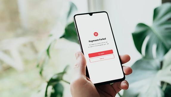
4. Design accessible input forms
Forms are an important part of websites and applications, and making them accessible is paramount. When designing and implementing forms, you need to ensure that they are easy to use and navigate for every user. Additionally, it is crucial to make interactive elements accessible, ensuring they are keyboard accessible to enhance usability and meet web accessibility standards.
Here are some things you should consider when designing accessible input forms:
Labels and instructions
The <label> element is a good way to provide clear and descriptive labels for form fields. It is also worth including instructional text or tooltips so that users can understand the purpose of each form field. For a specific input field, it can be useful to provide recommendations on how to correctly fill out the form.


Error processing
A good practice is to display error messages next to the associated form fields and highlight the field, for example, in red, when users enter incorrect data. Error messages should be descriptive and indicate exactly what the error is and how to fix it.

To do this, you can use ARIA attributes, such as aria-described by, to associate error messages with appropriate form fields for assistive technology users.
<label for="name">
  First name
</label>
<input type="firstname" id="name" aria-describedby="fn_desc">

<p id="fn_desc">
  Please use letters only for the first name field.
</p>
Example of using the 'aria-describedby' attribute
Focus control
When users interact with form elements, these elements receive focus, indicating their active state. Avoid unexpected changes in focus context, as this can confuse users.
Form controls
The use of semantic HTML elements such as <input>, <textarea>, and <select> increases the usability and accessibility of web forms, as they are read correctly and clearly by screen readers.


5. Enable keyboard navigation
Keyboard navigation is necessary for users who cannot use a mouse. To ensure web content is accessible via the keyboard, you should pay attention to focus management, focus order, and focus indicator. Let’s look at some examples.
- Focus management. Proper focus management allows keyboard users to navigate the page without difficulty:

- Focus order. Logical focusing order helps users navigate content intuitively:

- Focus indicator. Visible focus indicators help users identify the element that currently has focus:

6. Utilize hierarchical headings and descriptive link text
Using hierarchical headings and descriptive link text is crucial for making web content accessible, especially for users relying on screen readers. Hierarchical headings provide a clear structure, making it easier for screen readers to navigate through the content. Start with a clear and concise title that accurately describes the page’s content. Use headings (H1, H2, H3, etc.) to break up the content logically, ensuring that the headings follow a sequential order.

Descriptive link text is equally important. Instead of using generic phrases like “Click here,” use text that provides context about the link’s destination. For example, “Learn more about our products” or “Contact us for more information” gives users a better understanding of where the link will take them. This practice not only improves accessibility but also enhances the overall user experience.
7. Provide audio alternatives and transcripts for multimedia content
To make multimedia content accessible to users with visual or hearing impairments, providing audio alternatives and transcripts is essential. Audio alternatives, such as transcripts or audio descriptions, allow users to access the content of videos or podcasts in a different format.
Start by creating a transcript of the multimedia content. This can be done manually or by using a transcription service. Once the transcript is ready, provide a link to it on the same page as the multimedia content. Additionally, consider offering audio descriptions, which are verbal descriptions of the visual elements in a video. This can be achieved by providing a separate audio file that narrates the visual content. These steps ensure that all users, regardless of their abilities, can fully engage with your multimedia content.
Testing and improving web accessibility
Testing and improving web accessibility is an ongoing process that requires regular evaluation and updates. There are several methods to test web accessibility, including automated testing tools, manual testing, and user testing.
Automated testing tools like WAVE or Lighthouse can quickly identify common accessibility issues such as missing alt text, poor color contrast, and navigation problems. However, automated tools may not catch all issues, so manual testing is also necessary. This involves using a screen reader or other assistive technology to navigate the website and identify any accessibility barriers.
User testing is another valuable method, where real users, including those with disabilities, test the website and provide feedback on its accessibility. This approach offers insights that automated and manual testing might miss.
Regularly reviewing and improving web accessibility is crucial. Make it a habit to periodically check your website for accessibility issues and make necessary improvements. Providing ongoing training and resources for developers and content creators ensures that they have the knowledge and skills to create accessible web content. By continuously testing and improving, you can significantly enhance your website’s accessibility and provide a better experience for all users.
The bottom line
Creating a more accessible website is crucial for making sure that all users, regardless of their abilities, can interact with your website effectively. Improving a website's accessibility not only benefits users with disabilities but also enhances the overall user experience and can positively impact SEO rankings. By following our best practices—using semantic HTML, adding alt texts, optimizing color contrast, designing accessible input forms, and enabling keyboard navigation—you can make significant progress towards improving web accessibility.
We highly recommend exploring the WCAG guidelines for a comprehensive list of recommendations to further enhance your website’s accessibility. By implementing these practices and incorporating basic accessibility requirements into the design process, you’ll contribute to a more inclusive web experience for everyone.
Want to check how accessible your website is and whether it complies with various accessibility standards? We can help. Get in touch to learn more about our accessibility testing and audit services.